All products
Web Design & Development

Custom Website Design

A website designed for your business, not adapted from a template.

We design and build websites one client at a time: no theme, no page builder, no stock layout. Every site starts from your existing material and goals, is designed for large desktop screens first and scaled down to phones, and ships as its own isolated project with its own domain, hosting and mail. Choose the level that fits: a fast online presence, a brand site built around your own film and photography, or an immersive experience with 3D and motion that follows the scroll. We host it, keep it updated and change it when your business changes.

Built for

Small and mid-sized businesses, founders and brands who want a site that is entirely their own

Use cases

  • Trades and local businesses that need a clean, credible online presence
  • Coaches, studios and practices whose brand lives in film and photography
  • Product launches that should feel like an event, not a brochure
  • Businesses moving off Wix, Squarespace or an ageing WordPress theme

Reference builds

Two clients, two very different sites.

Each one is its own project with its own design, code, domain and hosting. Nothing is shared between them, so each could be changed or moved without touching the other.

templarphysiquecoaching.com
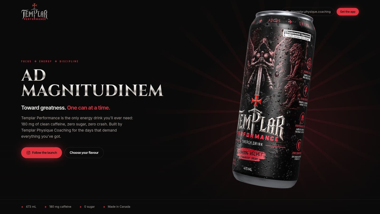
Templar Performance home page on a desktop screen
Immersive 3D & motion

Templar Performance

Templar Physique Coaching

Launch site for an energy drink, built around a real-time 3D can that follows the scroll, lands with an impact and pours itself again when you switch flavour.

  • Interactive 3D can with the real label artwork
  • The camera follows the scroll, switching flavour recolours the page
  • English and French
  • Built-in mail client for the team
Visit the live site
colonnacoaching.com
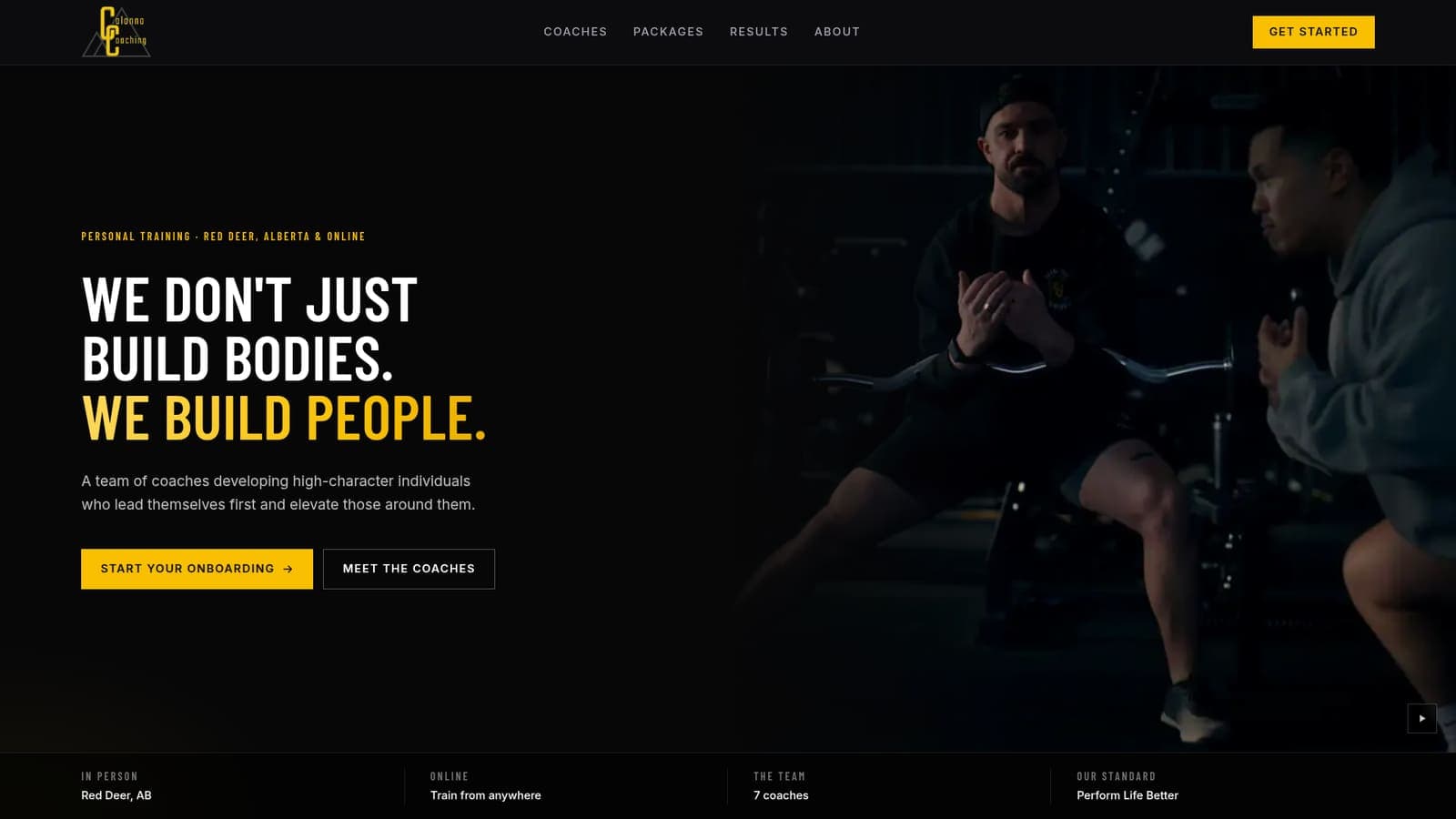
Colonna Coaching home page on a desktop screen
Brand & film

Colonna Coaching

Colonna Coaching, Red Deer, Alberta

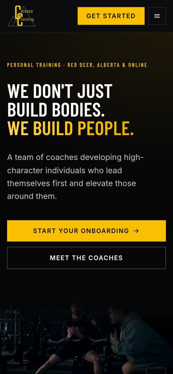
A made-to-measure site built around what the team already had: their brand film, their visual identity and their coaches. The film and a loop cut from it carry the pages, every coach gets a profile, and an onboarding form takes in clients and coach applicants. Rebuilt from Wix.

  • Designed around the client's own brand film
  • Hero loop cut from the existing footage
  • Coach profiles, packages and client results
  • Two-track onboarding form by email
Visit the live site

Designed twice

The phone gets its own design, not a squeezed one.

A phone is held differently, scrolled differently and has a fraction of the room. So we design it separately. On Templar Performance the two barely behave alike.

Templar Performance on a desktop screen

On a desktop, 1920 wide

  • One 3D can for the whole page, pinned while the camera moves around it
  • The claims section zooms in on each claim printed on the can
  • Scrolling through the flavour section twists the can to the next flavour
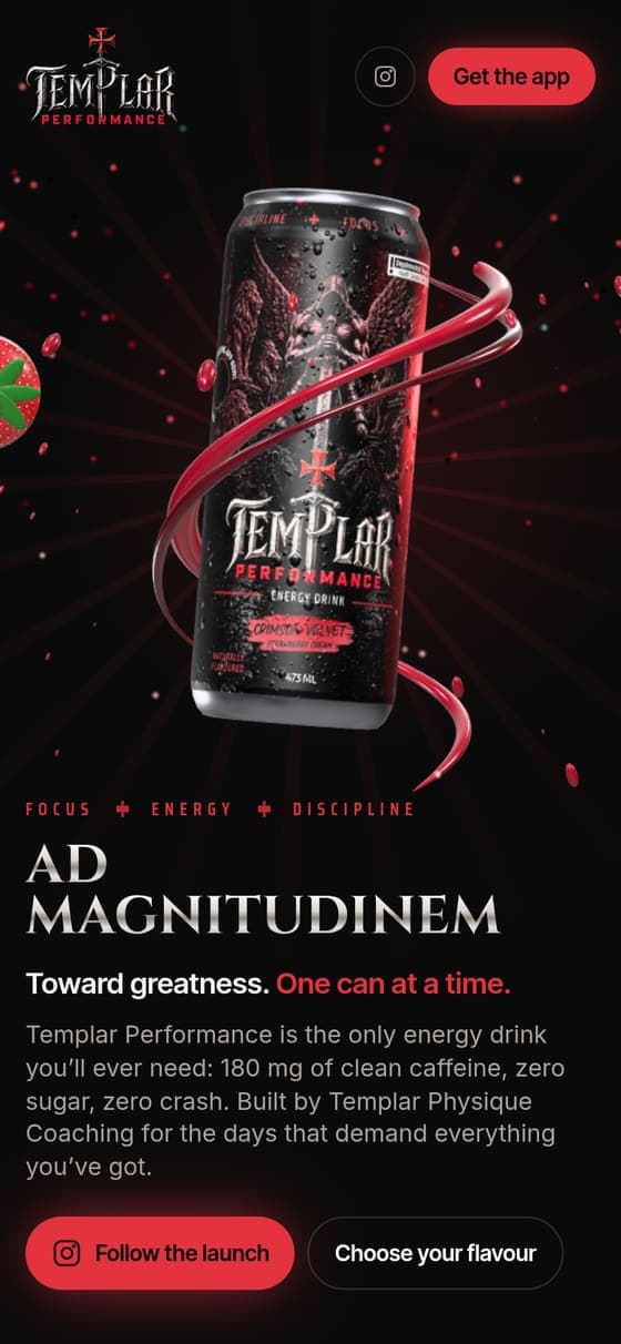
Templar Performance on a phone

On a phone, 390 wide

  • Nothing is pinned: the can sits in the content and scrolls with it
  • Between sections it shrinks away and grows back with a turn, never over the copy
  • Claims become tiles, flavours switch with a swipe or a segmented control

One step further

An app on the phone, a website on the desk.

For bigger builds the phone version can be a web app in its own right: installed to the home screen, with a tab bar and gestures, and no browser feel at all. On a desktop the same address stays a proper website. Each is designed and built for its own screen, so neither is compromised for the other.

Built this way: AI Body Coaching

Phone

Feels like an app

  • Installable, opens full screen
  • A tab bar at the bottom, like a native app
  • Gestures and sheets instead of pages
  • Works on a weak connection

Desktop

Feels like a website

  • Wide layouts that use the screen
  • Navigation, links and search as expected
  • Room for detail, tables and charts
  • Fully findable by search engines

Capabilities

What goes into every build.

Not a package with add-ons: this is how we work on every site, whatever its size.

Designed from scratch

No template and no page builder. Layout, type and motion are designed around your brand, with two or three directions explored for the key pages.

Desktop and mobile, designed separately

Wide screens and phones each get their own design, not one layout squeezed down. Where it pays off, the phone version behaves completely differently.

Built around your film and imagery

Your brand film, footage and photography become the centre of the design, joined by video loops, interactive 3D and motion that follows the scroll where they earn their place. Motion switches off for visitors who prefer it reduced.

Your content, carried over

Every text, photo, testimonial and video from your current site is moved across, including the pages nobody links to anymore.

App feel on phones

For bigger builds the phone version can be an app in its own right, installed to the home screen and used like one, while the desktop stays a website. Each is designed for its own screen.

Hosted and looked after

Domain, certificates, forms, mail, search basics and updates are handled by us. Each site runs on its own, so nothing one client does can touch another.

See the reference builds